What do high school laboratory reports and scientific journal publications have in common? At all levels of science, we often need to showcase data in a nice presentable form. There are many different graphs that allow us to do so, but the most commonly used is the humble scatter graph. Independent vs dependent variables? Discrete vs continuous data? Line of best fit? Read on to discover how you too can plot wonderful scatter graphs!
Choosing the Right Graph
The type of graph you use always depends on the data you have to present.
Independent vs Dependent Variables
We can define our ‘variables’, that is, our data sets, by whether they are independent or dependent.
An independent variable is a parameter that we are in control of, that is subject to change. A good experiment will likely have just one independent variable at any one time. For example, we can change the temperature of a reaction by using a water bath.
A dependent variable is a parameter that changes as a result of the change we made to the independent variable. If we change the temperature of a reaction (independent variable), what is the resulting change in the rate of a reaction (dependent variable)?
Discrete vs Continuous Data
We can also classify our data sets as being either discrete or continuous variables.
Discrete data consists of numbers that fall into distinct categories, such that they can be counted. For example, the number of boys in a class, or the number of Sundays in the year 1965.
Continuous data sets have numbers that can take on any value across a range. We can measure such data, but only to a certain degree of accuracy. Time is a good example of a continuous variable. We can measure the time it takes for a reaction to complete using a clock, to get the time in minutes and seconds. We could get a higher degree of accuracy with a stopwatch, which would allow us to measure time in milliseconds.
When to Use a Scatter Graph?
We use scatter graphs when we want to show how a dependent variable changes as we alter the independent variable. Both dependent and independent variables usually consist of continuous data when plotting a scatter graph. For discrete data sets, bar graphs are most commonly used, while pie charts can compare multiple variables that form part of a whole.
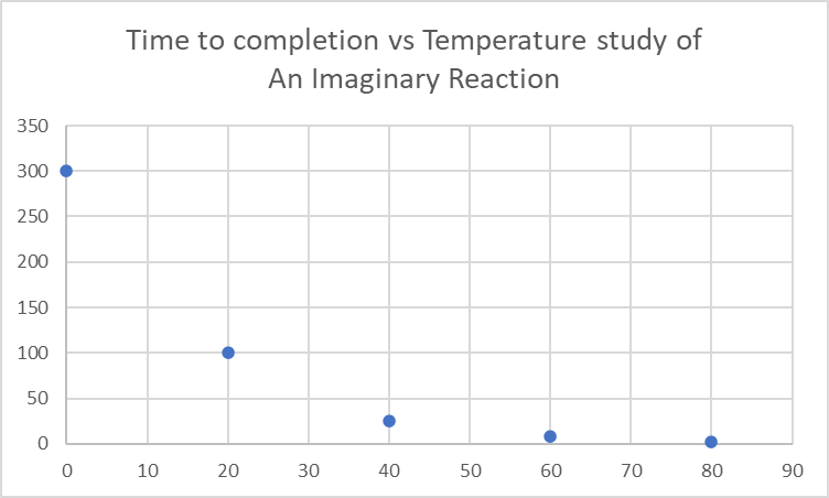
Although this may sound oddly specific, we often come across continuous data sets that consist of 1 dependent and 1 independent variable. For example, we might want to study the time it takes for a reaction to go to completion (dependent variable) under different temperatures (independent variable).
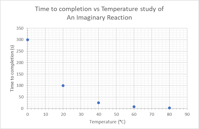
After conducting the experiment, we have obtained some data that we might want to plot:

Plotting it using graphing software (Microsoft Excel, in this case) generates something of this sort:

There you go, a simple scatter plot! It clearly shows that increasing the temperature speeds up the reaction. As the horizontal (x-axis) increases, there is a decrease in the vertical axis (y-axis) value. It can be appropriate sometimes to draw a line of best fit to better represent the relationship between the dependent and independent variables (more on this in the later section).
Graphing Basics
Now that we have an idea of what a scatter plot looks like, below are certain formatting guidelines that should be followed to create wonderful graphs in general!
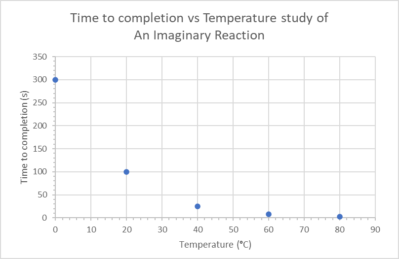
Titles are Important!
Your graph should always have context! Remember that your graph has to make sense to the reader even in isolation from the rest of the text/report, that’s what makes graphs such powerful presentation tools. A general rule of thumb is to name the graph:
‘[y-axis] vs [x-axis] of/for [system]’
In the example used above, this would be something like:
This gives readers ample context without cluttering the title with information. It is important to name it [y-axis] vs [x-axis] and not the other way round! This is as because you are portraying y (dependent variable) as a function of x (independent variable).
Always Label the Axes
Both axes should be labeled with their corresponding parameters as well as their units (in brackets). Most graphing software will allow you to label the axes in their direction.
Another thing you might want to include is a figure legend if you have multiple plots within the same graph. Make sure it’s easy to match the plot to the legend (using distinct colors, shapes, etc).

Gridline Formatting
Once you have the texty bits under control, you have the option to increase or decrease the number of gridlines, which depends on what your data is trying to highlight.
Increasing the density of gridlines is obviously important if you are trying to highlight key values within your plots that would be difficult to spot without. However, if the idea is to showcase a general correlation or relationship between the variables, there is no need to go overboard with them.
One thing to note is that gridlines should be present for BOTH x and y axes. Otherwise, it’s better to just do away with them altogether.
You might have noticed axis ticks in the graph above, which are the slightly more pronounced ticks along the axes that highlight the gridlines. that I prefer to use facing into the graph. Most graphing software will have the option to include these. You may choose inward-facing ticks or outward-facing ones if you have plot points very close to the axes.
Line of Best Fit?
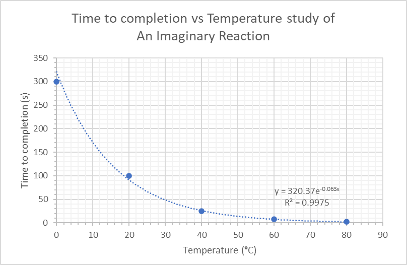
You might be under the impression that a graph isn’t complete without a line of best fit running through as many points in the graph as possible, but this isn’t the case. Not all scatter plots require best-fit lines. Scatter plots can show that a correlation exists between the two variables, which is often enough. And for the love of science, do not ‘join the dots’ of a scatter plot (unless they happen to form a drawing, of a cat, for instance). Otherwise connecting the dots provides no added value.
As a rule of thumb, we only need a line of best fit if we want to present or study a linear or logarithmic correlation between the variables. The data we used above happens to fit into an exponential line pretty well, with an R2 value of 0.9975. R2 (R-squared) is a measure of how well the data points ‘fit’ the line, and has values between 0 and 1, with a higher value indicating a better fit.
It is often appropriate to include this value along with the equation of the line when we generate a line of best fit, so others can compare how well our proposed line actually fits the experimental data obtained.
If an exponential relationship exists between the variables, we can uncover a linear relationship between the two by plotting the natural log (ln) of the y-axis vs the x-axis.
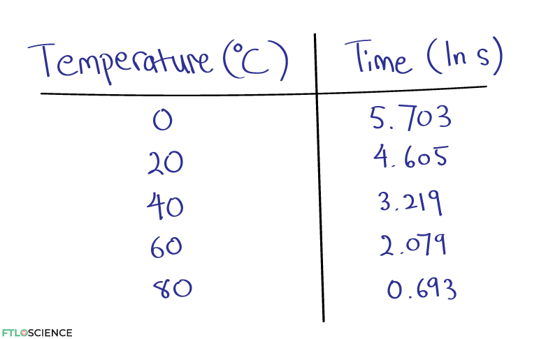

This makes it easier to visualize and predict the outcomes of the dependent variable as the independent variable is altered, even for values not studied experimentally! We can now predict the time it will take for the reaction to complete at temperatures like -10 °C or 110 °C and even beyond.
And there you have it, a guide plus good practices when plotting a scatter graph. Happy graphing! If you have any suggestions or complaints, please don’t hesitate to contact us.
About the Author

Sean is a consultant for clients in the pharmaceutical industry and is an associate lecturer at La Trobe University, where unfortunate undergrads are subject to his ramblings on chemistry and pharmacology.